Back
Improving Search Experience for Gym, Class, and Trainer on FitCells
Improving Search Experience for Gym, Class, and Trainer on FitCells
Fit.cells provides services for booking gyms, classes and getting a personal trainer
Fit.cells provides services for booking gyms, classes and getting a personal trainer
overview
My Role
My Role
PIC Designer — Requirement Detailing, Research, Flow Design, Information Structure Design, Visual Design, Design Handoff.
PIC Designer — Requirement Detailing, Research, Flow Design, Information Structure Design, Visual Design, Design Handoff.
Team
Team
The team consisted of 2 Designers, 1 Project Manager, 2 Mobile engineers and 2 BE engineer.
The team consisted of 2 Designers, 1 Project Manager, 2 Mobile engineers and 2 BE engineer.
Timeline
Timeline
Q2 2022
Q2 2022
Overview
Overview
Fit.cells is an app that helps people book gyms, classes, and personal trainers. Search is essential for users who are looking to book a service, but they can become frustrated if they can't find what they're looking for. This can lead to users leaving the app and looking elsewhere, which is a problem for both businesses and users.
Fit.cells is an app that helps people book gyms, classes, and personal trainers. Search is essential for users who are looking to book a service, but they can become frustrated if they can't find what they're looking for. This can lead to users leaving the app and looking elsewhere, which is a problem for both businesses and users.

Background
Addressing Feedback, Refining Search Accessibility
Addressing Feedback, Refining Search Accessibility
In February 2022, our team received feedback that the search icon in the app was difficult to find and that some users were unaware search icon existed on the page. Thus, we believe that we need to enhance the search experience. After digging up more information we found not only the place of the search icon that needs to be improved but also some aspects such as information order needs to be Improved.
In February 2022, our team received feedback that the search icon in the app was difficult to find and that some users were unaware search icon existed on the page. Thus, we believe that we need to enhance the search experience. After digging up more information we found not only the place of the search icon that needs to be improved but also some aspects such as information order needs to be Improved.
Problems
Identifying the Underlying Issues
Discovering User Behavior on App
Identifying the Underlying Issues, Discovering User Behavior on App
We use analytic tools to analyze user behavior data in order to identify problems, UXCam was the analytics tool that we used. After analyzing the data, here are some user behavior that has found.
We use analytic tools to analyze user behavior data in order to identify problems, UXCam was the analytics tool that we used. After analyzing the data, here are some user behavior that has found.
1
1
Category Over Name
Category Over Name
Most users write down the category they are looking for, compared to the name of the gym/class/trainer. This suggests that users are more interested in finding the right type of gym, class, or trainer for their needs, rather than a specific name.
Most users write down the category they are looking for, compared to the name of the gym/class/trainer. This suggests that users are more interested in finding the right type of gym, class, or trainer for their needs, rather than a specific name.
2
2
Users Search for Gym Studios Instead of Names
Users Search for Gym Studios Instead of Names
Most user writes name of the place where the class comes from (gym studio) instead of the class name. For example, users may be more familiar with the names of gym studios than the names of specific classes.
Most user writes name of the place where the class comes from (gym studio) instead of the class name. For example, users may be more familiar with the names of gym studios than the names of specific classes.
3
3
None of Users Use Map as Filter While Searching
None of Users Use Map as Filter While Searching
None of the user has actually using this feature to find their desired gym or class. Users may find more convenient to simply browse by keywords. While the list of the gym or class are already filtered by closest distance from user.
None of the user has actually using this feature to find their desired gym or class. Users may find more convenient to simply browse by keywords. While the list of the gym or class are already filtered by closest distance from user.
Evaluate Current App Interface
Evaluate Current App Interface

Click Image to Zoom
Click Image to Zoom
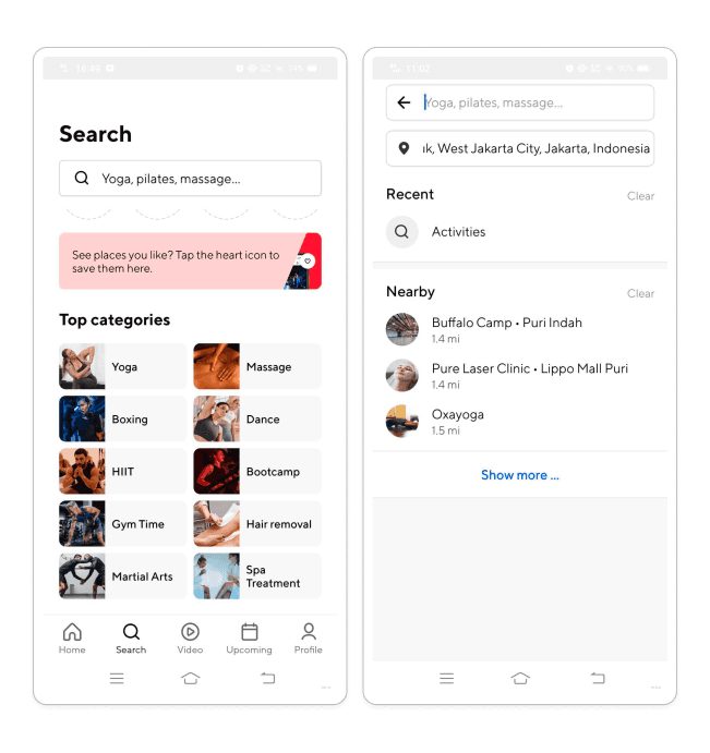
The search flow is quite simple yet not quite helpful. After landing on the home page the user needs to select a category between Gym, Class, or Trainer then after entering the see all page the user needs to find the search icon so that they can search. If you look at the menu of this search page, there are several things that need to be improved both the flow, information structure, and visual aspect.
The search flow is quite simple yet not quite helpful. After landing on the home page the user needs to select a category between Gym, Class, or Trainer then after entering the see all page the user needs to find the search icon so that they can search. If you look at the menu of this search page, there are several things that need to be improved both the flow, information structure, and visual aspect.
Indetifying Problem in Search Navigation Menu
Indetifying Problem in Search Navigation Menu

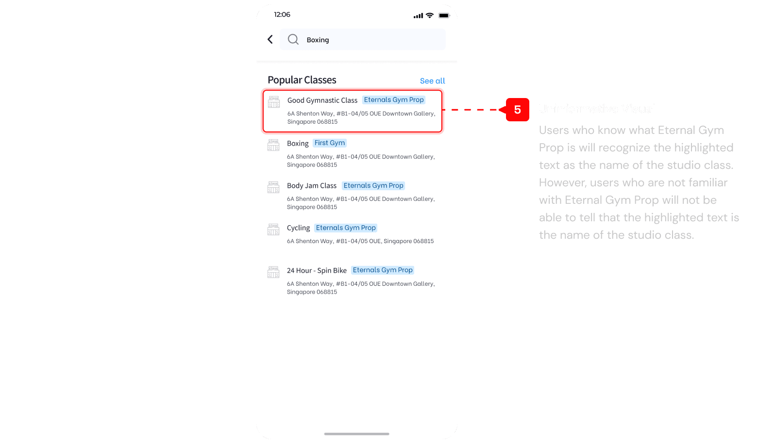

A lot of component of design are lack visual balance, from the icon size, font size, color hierarcy make the design look not engaging. The lack of visual balance makes the design look cluttered and overwhelming, making it difficult for users to focus on the most important elements. As a result, users are less likely to be engaged with the design and may have difficulty finding the information they need.
Our team is tasked with improving the search experience based on user feedback. However, our product owner has also invited us to suggest other UI improvements. I was eager to contribute, particularly as I was concerned about the current card design. I confidently presented my ideas, and I am pleased that we will be able to address this issue. I try to present other design concern but we were limited by resources. At least by redesigning the carding we were able to commit to a 30% visual improvement of the app, which are the first elements that users see when they enter the app.
Click Image to Zoom
Goals
Our Primary Objective Goals are…
Our Primary Objective Goals are…
To ensure that our current initiatives are aligned with our overall vision, we have defined their specific goals and objectives, which include:
To ensure that our current initiatives are aligned with our overall vision, we have defined their specific goals and objectives, which include:
How might we help users easily find the gym, class, or trainer that best meets their needs?
How might we help users easily find the gym, class, or trainer that best meets their needs?
How might we present information in a way that is clear, concise, and easy to digest?
How might we present information in a way that is clear, concise, and easy to digest?
How might we increase the conversion percentage from user who book a session in app
How might we increase the conversion percentage from user who book a session in app
User archetype
Understanding the Fitness Consumer Behavior
A Deep Dive into User Types and Needs
Understanding the Fitness Consumer Behavior, A Deep Dive into User Types and Needs
I do a user interview to found out behavior when people want to book a class or gym or trainer, what aspect that they has in mind when start to search. I got into conclusion that when a user searches for something on an app, there are three types of users;
I do a user interview to found out behavior when people want to book a class or gym or trainer, what aspect that they has in mind when start to search. I got into conclusion that when a user searches for something on an app, there are three types of users;
The Discerning User
The Discerning User
This user knows exactly what they're looking for and has a specific name for it. For example, they might search for "revolt gym."
This user knows exactly what they're looking for and has a specific name for it. For example, they might search for "revolt gym."
The Exploratory User
The Exploratory User
This user has a general ideas of what they want, but they're still exploring their options. For example, they might search for "Muay Thai class" to learn more about different classes and instructors.
This user has a general ideas of what they want, but they're still exploring their options. For example, they might search for "Muay Thai class" to learn more about different classes and instructors.
The Serendipitous User
The Serendipitous User
This user fires up the app with no particular destination in mind. They're open to browsing and discovering new things. And might save interesting information to book later.
This user fires up the app with no particular destination in mind. They're open to browsing and discovering new things. And might save interesting information to book later.
Competitor Analysis
Unlocking the Secrets of User Expectations with Competitive Analysis
Unlocking the Secrets of User Expectations with Competitive Analysis
To benchmark user expectations and identify opportunities for improvement, we conducted a competitive analysis of our top competitors. In this landscape, I take look at 3 aspects: layout, information and position.
To benchmark user expectations and identify opportunities for improvement, we conducted a competitive analysis of our top competitors. In this landscape, I take look at 3 aspects: layout, information and position.
1
1
Doofit
Doofit

Search bar are at top of the page that easily to notice.
Search bar are at top of the page that easily to notice.
Provide different option for online, offline, venue, or package. The default option are online. It is unclear why there are different filter options are separated in the search results, as this may confuse users about the meaning of the different types of options since the design are same.
Provide different option for online, offline, venue, or package. The default option are online. It is unclear why there are different filter options are separated in the search results, as this may confuse users about the meaning of the different types of options since the design are same.
Provide date filter to search for user who already has specific date to book.
Provide date filter to search for user who already has specific date to book.
2
2
Classpass
Classpass
Search bar is on the top of the screen, user might easily gist.
Search bar is on the top of the screen, user might easily gist.
While searching user able to setup location first, this may to help user find the nearest class.
While searching user able to setup location first, this may to help user find the nearest class.
3
3
Mindbody
Search bar are on top of screen and easily to find.
Search bar are on top of screen and easily to find.
Mindbody provide location filter to search.
Mindbody provide location filter to search.
User able to set specific date and time to search, this may help user who already has specific date and time in mind.
User able to set specific date and time to search, this may help user who already has specific date and time in mind.
User need to select first between fitness, wellness or beauty. While the classes and business are quite ambiguous, what does business mean here?
User need to select first between fitness, wellness or beauty. While the classes and business are quite ambiguous, what does business mean here?
4
4
Strongbee
Strongbee

Search bar are on top of screen and easily to find.
Search bar are on top of screen and easily to find.
User able to choose what type they want to search below the search bar, quite direct and easy to understand.
User able to choose what type they want to search below the search bar, quite direct and easy to understand.
I guess here they are showing popular data from classes, trainers, etc for recommendation to user
I guess here they are showing popular data from classes, trainers, etc for recommendation to user
After searching there are information that inform user for total result they get, from what they search. It helps users to manage their expectations.
After searching there are information that inform user for total result they get, from what they search. It helps users to manage their expectations.
Bottom Line
Bottom Line
From all those four apps they have the search field prominently displayed at the top of the page, which makes it easy for users to find. Provide information on the total number of results for a given search query, which helps users to manage their expectations. Providing category menu to select might helps users to narrow down their search results quickly and easily.
From all those four apps they have the search field prominently displayed at the top of the page, which makes it easy for users to find. Provide information on the total number of results for a given search query, which helps users to manage their expectations. Providing category menu to select might helps users to narrow down their search results quickly and easily.
Crafting Solution
Designing Solution, New Search Experience
Designing Solution, New Search Experience
As a UX designer, I'm always mindful of the fact that users spend most of their time on other sites and apps. This means that they expect your site to work the same way as all the other system they already know.
As a UX designer, I'm always mindful of the fact that users spend most of their time on other sites and apps. This means that they expect your site to work the same way as all the other system they already know.
1
1
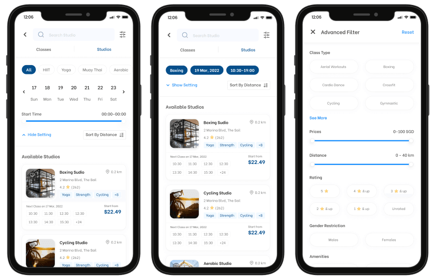
Optimizing the Feature Placement
Optimizing the Feature Placement
The old design is functional, but it does not draw the user's attention. Converting the top bar into a search field makes it easier for users to find the search menu. By increasing the precision of the calendar's date component, users will be able to scan the information they read more easily. Adapting with our user's behavior when looking for a gym and including a time range in the search, it is easier for the user to receive more recommendations and flexibility in determining the gym schedule.
The old design is functional, but it does not draw the user's attention. Converting the top bar into a search field makes it easier for users to find the search menu. By increasing the precision of the calendar's date component, users will be able to scan the information they read more easily. Adapting with our user's behavior when looking for a gym and including a time range in the search, it is easier for the user to receive more recommendations and flexibility in determining the gym schedule.
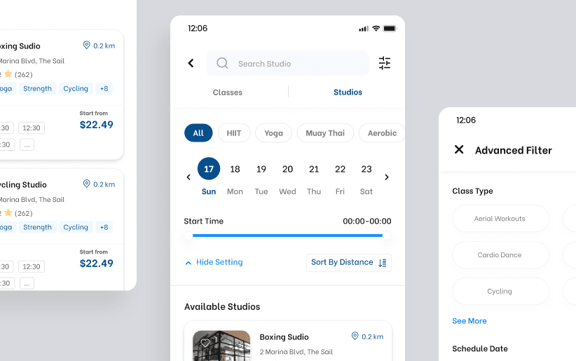
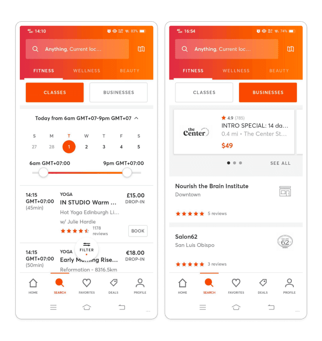
Since this filter menu sticks above the page, it will be difficult for users with small phone screens because the filter section takes up almost 40% of the screen width.
When the user scrolls down the page, the menu will automatically shrink and the filter information will be summarized, allowing the user to see the currently applied filter values without having to scroll back up
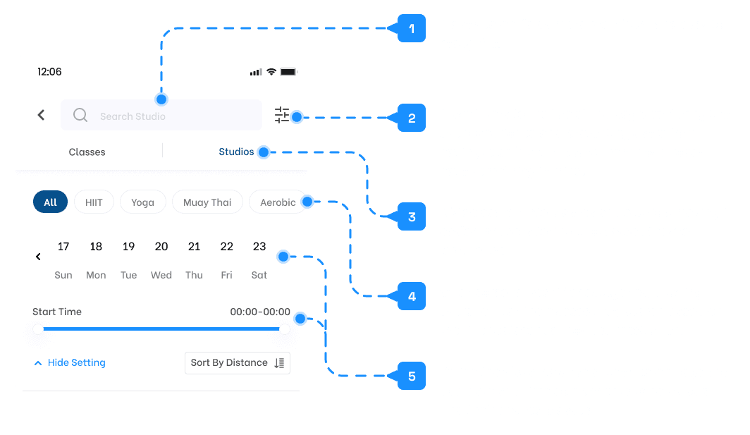
1
Make search fields more prominent and easy to recognize.
2
Move filters to the top of the page, centering the user experience and preventing users from having to shift their focus when they already have something in mind.
3
Divide search into classes and studios, making it easier for users to find the classes they're looking for.
4
Offer personalized filter categories, allowing users to filter the classes they search based on the filter categories they use most often.
5
Refine the visual balance of the search page and add date and time components to help users find their desired classes.

2
2
User-Tailored Filter
User-Tailored Filter
This filter provide personalization, which will provide users with the most relevant options. This time, users will be able to search for classes based on their interests in the class search menu.
This filter provide personalization, which will provide users with the most relevant options. This time, users will be able to search for classes based on their interests in the class search menu.

3
3
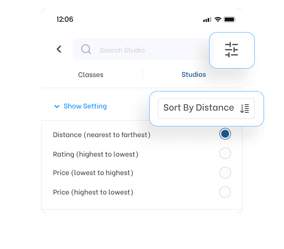
Centralized Information
Centralized Information
Place filters and sorting at the top of the page to improve focus and scanning. In the previous design, the sort and filter options were located at the bottom of the page, which forced users to shift their focus when searching. By moving these options to the top of the page, we can help users to focus on their search and scan the results more efficiently.
Place filters and sorting at the top of the page to improve focus and scanning. In the previous design, the sort and filter options were located at the bottom of the page, which forced users to shift their focus when searching. By moving these options to the top of the page, we can help users to focus on their search and scan the results more efficiently.
4
4
Make Key Information More Accessible
Make Key Information More Accessible
The previous design's unbalance hierarchy made it difficult for users to scan and understand the key information. By improving the information structure, we can help users to easily find the information they need. For example, instead of using bold text to highlight all important information, we can use a typographic hierarchy and experiment with font weights to create a more visually appealing and informative design.
The previous design's unbalance hierarchy made it difficult for users to scan and understand the key information. By improving the information structure, we can help users to easily find the information they need. For example, instead of using bold text to highlight all important information, we can use a typographic hierarchy and experiment with font weights to create a more visually appealing and informative design.
Click Image to Zoom
Adding time information to the schedule is intended to simplify the process of identifying classes that align with the user's desired schedule.
Adding time information to the schedule is intended to simplify the process of identifying classes that align with the user's desired schedule.
5
5
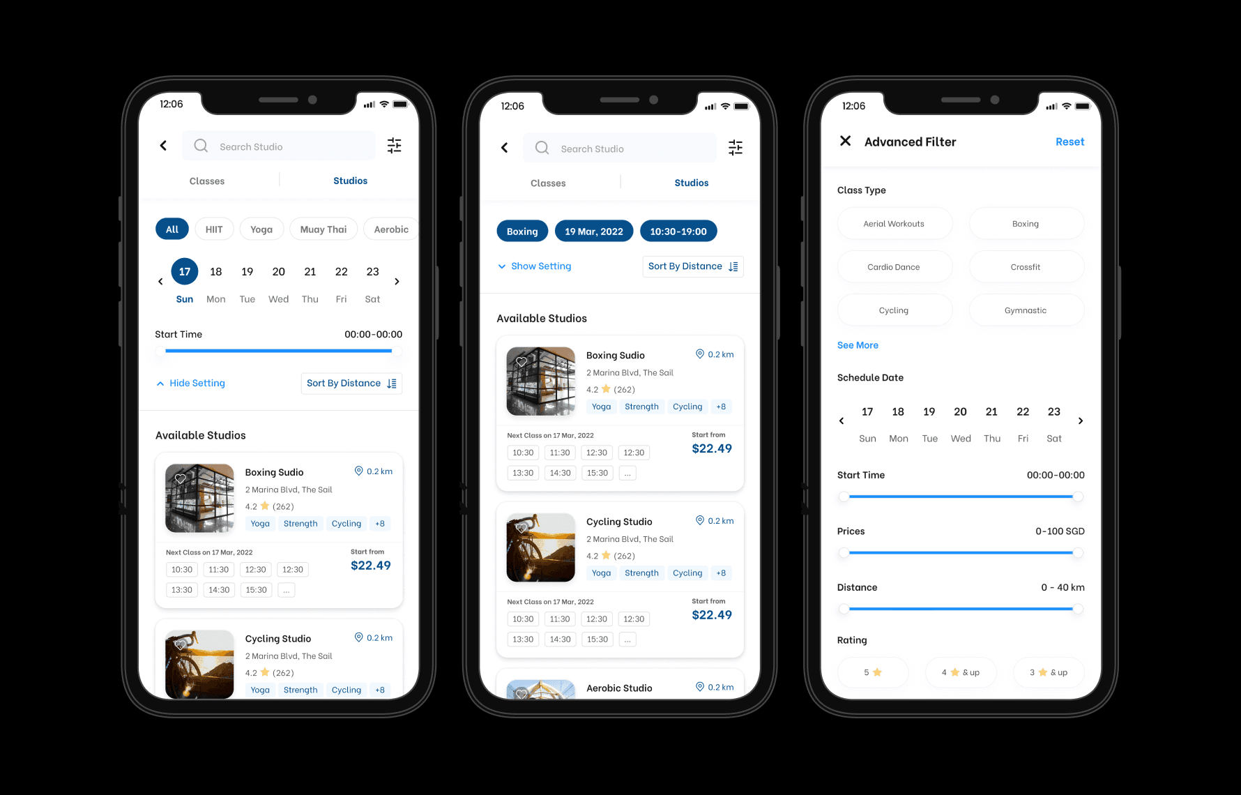
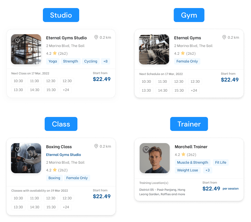
Classes Studio
Classes Studio
Users can now directly search for studios that offer the classes they are interested in, making it easier to find the studio they are looking for.
Users can now directly search for studios that offer the classes they are interested in, making it easier to find the studio they are looking for.
Click Image to Zoom
Click Image to Zoom
In the previous design, the studio was only listed as a supplement to the class name. In the new design, users can search for classes by studio, making it easier to find classes in their desired location. Mileage is often a major factor that users consider when choosing a class, so this improvement will be helpful for users who are familiar with certain studios and want to find classes there.
In the previous design, the studio was only listed as a supplement to the class name. In the new design, users can search for classes by studio, making it easier to find classes in their desired location. Mileage is often a major factor that users consider when choosing a class, so this improvement will be helpful for users who are familiar with certain studios and want to find classes there.
Final Result
Final Result

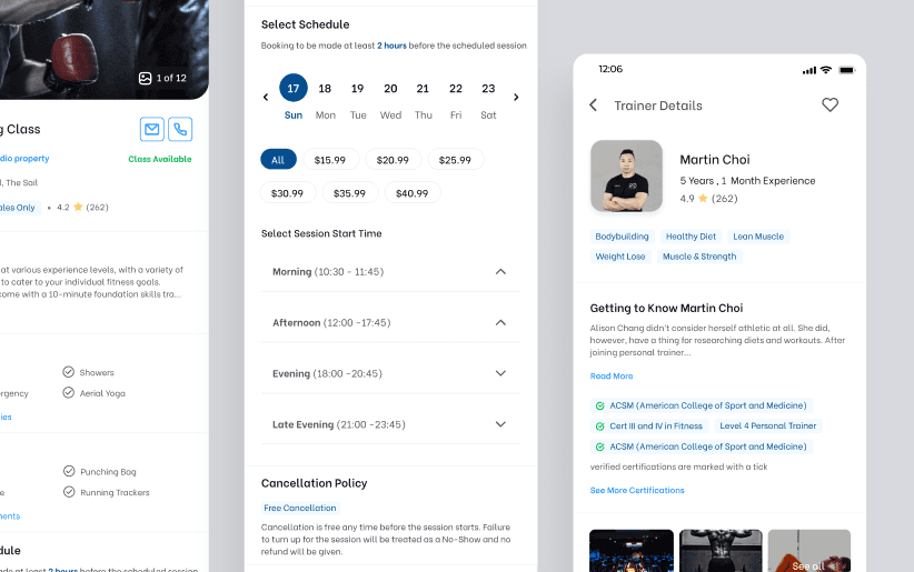
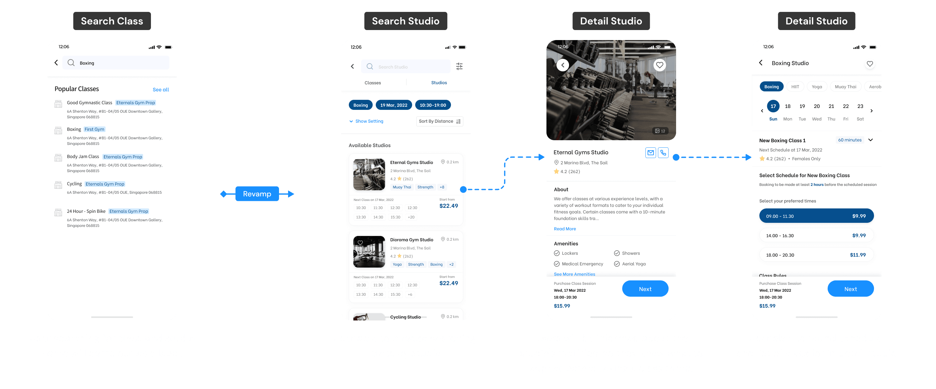
Click Image to Zoom
Click Image to Zoom
The final design for class search allows users to search for classes directly by category, date, and time. Gym doesn't contain data for categories, so users can only search by date and time. Trainer sessions are booked by package only, so date is not relevant, and the most important information is the trainer category and price per session. All search results can be filtered by price per session, but for classes and gym sessions, date and time are the most important factors to consider when booking. To avoid too many filters and encourage users to find their desired date and time, these two factors are prioritized.
The final design for class search allows users to search for classes directly by category, date, and time. Gym doesn't contain data for categories, so users can only search by date and time. Trainer sessions are booked by package only, so date is not relevant, and the most important information is the trainer category and price per session. All search results can be filtered by price per session, but for classes and gym sessions, date and time are the most important factors to consider when booking. To avoid too many filters and encourage users to find their desired date and time, these two factors are prioritized.
impact
End Result, Measuring Impact
End Result, Measuring Impact
We measured the metrics after we released the new search experience, and the results were amazing: booking numbers increased by 46%. We know that our marketing campaign may have played a role in this increase, but seeing progress is enough to know that our improvements are having a significant impact. Thank you to all the teams that helped make this improvement a reality.
We measured the metrics after we released the new search experience, and the results were amazing: booking numbers increased by 46%. We know that our marketing campaign may have played a role in this increase, but seeing progress is enough to know that our improvements are having a significant impact. Thank you to all the teams that helped make this improvement a reality.
Booking numbers increased by 46%*
Booking numbers increased by 46%*
*Side note: The exact numbers are omitted and rounded due to NDA.
*Side note: The exact numbers are omitted and rounded due to NDA.
NEXT PROJECT
NEXT PROJECT