Back
Enhancing Activity Engagement with Gelora's Redesigned Journey
Enhancing Activity Engagement with Gelora's Redesigned Journey
Gelora provides a platform for renting spaces and hosting sports activities
Gelora provides a platform for renting spaces and hosting sports activities
overview
My Role
My Role
PIC Designer — Feature Scoping, Research, Experience Design, Information Architect, Visual Design, Design Handoff
PIC Designer — Feature Scoping, Research, Experience Design, Information Architect, Visual Design, Design Handoff
Team
Team
The team consisted of 2 Designers, 1 Project Manager, 1 Associate PM, 3 FE engineers and 1 BE engineer.
The team consisted of 2 Designers, 1 Project Manager, 1 Associate PM, 3 FE engineers and 1 BE engineer.
Timeline
Timeline
Q3 2023
Q3 2023
Overview
Overview
Gelora is a company that offers a platform for renting out spaces and hosting sports activities. Users can book venues or participate in sports activities organized by various communities within Gelora. While focus of this phase is to launch activity and other MVP features first.
Gelora is a company that offers a platform for renting out spaces and hosting sports activities. Users can book venues or participate in sports activities organized by various communities within Gelora. While focus of this phase is to launch activity and other MVP features first.


Design process
Seeing the Forest and the Trees
A Comprehensive Look at the Process
Seeing the Forest and the Trees A Comprehensive Look at the Process
This is the recap of the process in this project. The whole process is not linear, there were times when we needed to go back and forth aligning with changes in business and communicate back with PM and client to find a middle ground in order to move forward.
This is the recap of the process in this project. The whole process is not linear, there were times when we needed to go back and forth aligning with changes in business and communicate back with PM and client to find a middle ground in order to move forward.

Click Image to Zoom
Click Image to Zoom
Project vision
Gelora currently has a website up and running, but they are looking to build the Gelora Smart Mobile app.
Gelora currently has a website up and running, but they are looking to build the Gelora Smart Mobile app.
Several reasons for this decision, including enhancing the user experience and making it more convenient and accessible when it comes to mobile app. Allowing users to have a more personalized experience and mobile app are often considered advantageous over websites, especially when push notifications are included.
Several reasons for this decision, including enhancing the user experience and making it more convenient and accessible when it comes to mobile app. Allowing users to have a more personalized experience and mobile app are often considered advantageous over websites, especially when push notifications are included.
How might we create a more streamlined and efficient activity journey, delighting customers and lowering churn?
How might we create a more streamlined and efficient activity journey, delighting customers and lowering churn?
We derive the overall MVP feature and flow from the client and utilize the existing flow present on the current Gelora website. However, as designer, I assess existing flow and proceed to rectify and enhance it in order to create a seamless experience.
We derive the overall MVP feature and flow from the client and utilize the existing flow present on the current Gelora website. However, as designer, I assess existing flow and proceed to rectify and enhance it in order to create a seamless experience.
PROblem
Untangling Complexity, an In-Depth Analysis from Designing Experiences
Untangling Complexity, an In-Depth Analysis from Designing Experiences
The focus of this phase is on the activity and several other MVP flows, such as onboarding, login and register, forgot password, change email, change phone number, edit profile, etc. The primary issue is centered around the activity journey, thus I will delve into the details specifically to this flow only.
I look through all of the Gelora webpages in order to grasp the system and map out the flow. While browsing the Gelora website, I map all of the screens in Figjam, making notes for prospective improvements and noting all of the current problems on their visual and system.
Existing Experience
Existing Experience
Click Image to Zoom
Click Image to Zoom
Analyzing Pain on Current Experience
Analyzing Pain on Current Experience

Click Image to Zoom
Click Image to Zoom
The Original Activity Flow
The Original Activity Flow
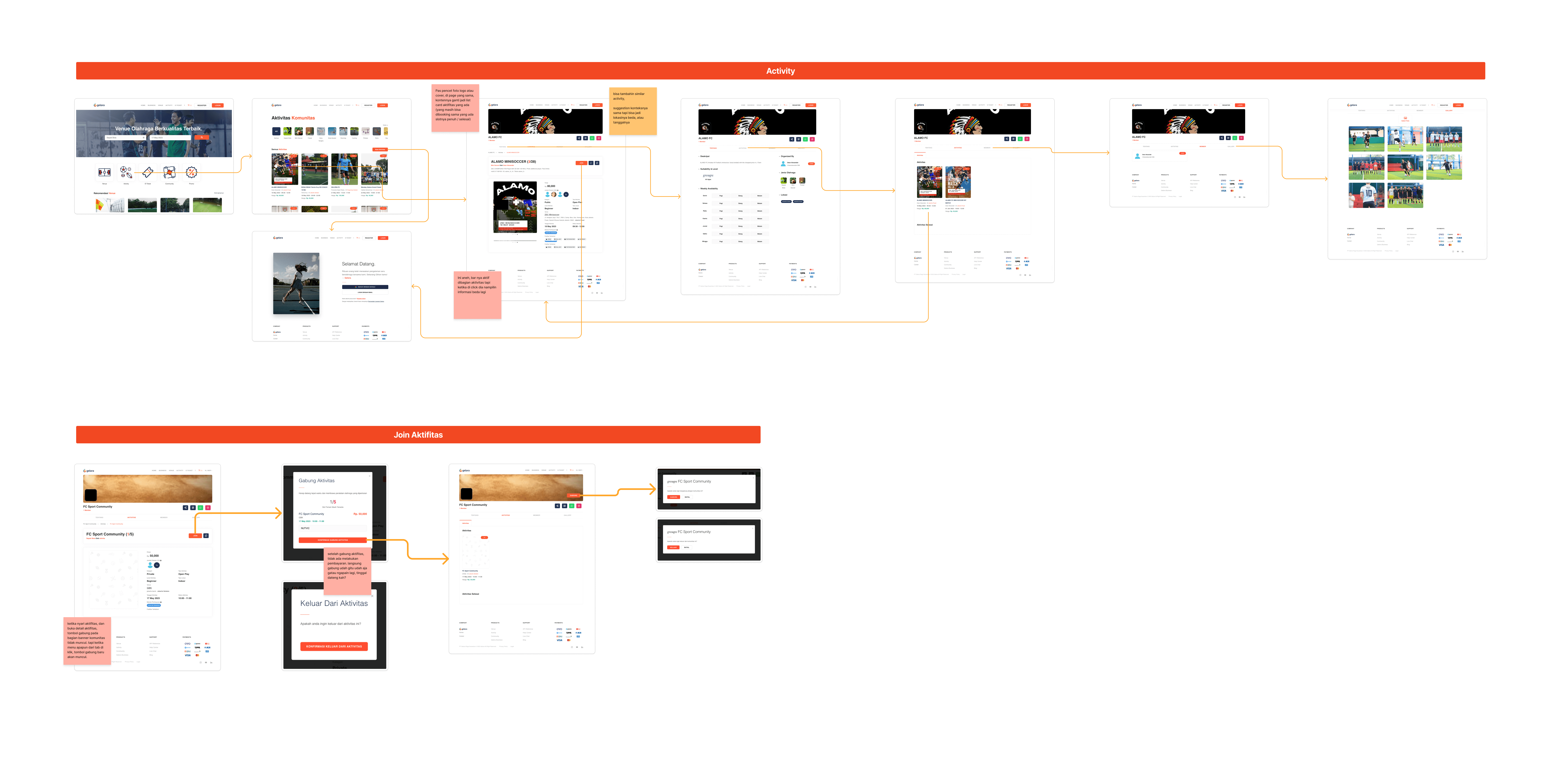
To understand gelora system I mapping their existing flow for activity by run through all the process to join activity on their website then visualize it.
To understand gelora system I mapping their existing flow for activity by run through all the process to join activity on their website then visualize it.

Click Image to Zoom
Click Image to Zoom
Problem Exist on Flow and Interface
Problem Exist on Flow and Interface
1
1
"Joined" and Then...Nothing?
"Joined" and Then...Nothing?
After a user joins, their status immediately changes to 'joined.' However, there is no feedback or communication provided for users to inform what next step they need to take, instead it leaves users with confusion after seeing status change to join.
After a user joins, their status immediately changes to 'joined.' However, there is no feedback or communication provided for users to inform what next step they need to take, instead it leaves users with confusion after seeing status change to join.
2
2
Payment Mystery
Payment Mystery
This activity involves payment details, yet there is no payment process outlined beforehand, nor are there any instructions or guidelines regarding the payment procedure.
This activity involves payment details, yet there is no payment process outlined beforehand, nor are there any instructions or guidelines regarding the payment procedure.
3
3
"Joined" But Unable to Confirm
"Joined" But Unable to Confirm
Users who have joined and have a 'join' status are unable to confirm their attendance. This poses significant challenges from an administrative perspective. When slots are filled, no payments or confirmations are made. There is no information available on how to contact the admin or seek help regarding the process.
Users who have joined and have a 'join' status are unable to confirm their attendance. This poses significant challenges from an administrative perspective. When slots are filled, no payments or confirmations are made. There is no information available on how to contact the admin or seek help regarding the process.
4
4
New User Churn
New User Churn
There is a high likelihood that new users, unfamiliar with the system, may become frustrated and discontinue using the service due to excessive confusion. The lack of helpful information exacerbates this issue.
There is a high likelihood that new users, unfamiliar with the system, may become frustrated and discontinue using the service due to excessive confusion. The lack of helpful information exacerbates this issue.
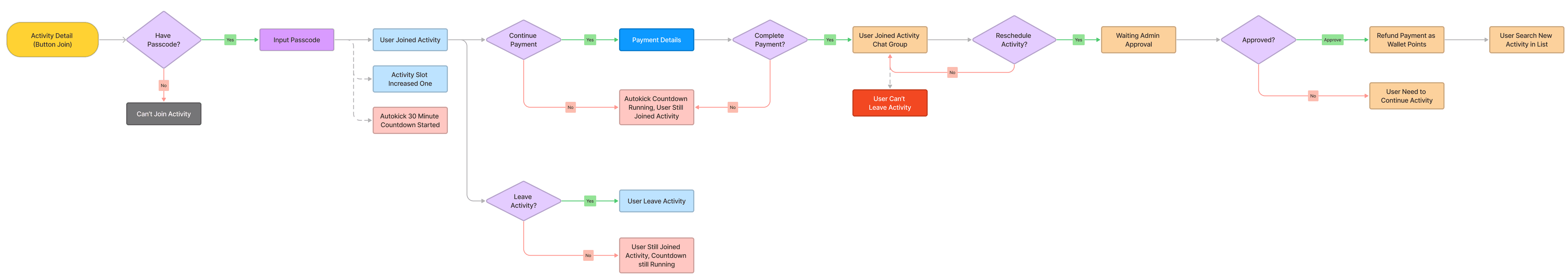
The Shiped Activity Flow
The Shiped Activity Flow
After a lengthy discussion with all relevant stakeholders and aligning with business requirements, several new flows have been added. These include the previously overlooked payment process as well as the rescheduled flow. Although I think this flow is still has concerning issue that could potentially result in an inconvenient experience that should be improved.
After a lengthy discussion with all relevant stakeholders and aligning with business requirements, several new flows have been added. These include the previously overlooked payment process as well as the rescheduled flow. Although I think this flow is still has concerning issue that could potentially result in an inconvenient experience that should be improved.
Click Image to Zoom
Click Image to Zoom
problem exist in this flow
problem exist in this flow
1
1
A Slot-Blocking Domino Effect
A Slot-Blocking Domino Effect
User status changes to 'joined' before payment, causing slots to fill up prematurely. Users with a 'joined' status but haven't made the payment end up occupying available slots for an activity, decreasing the likelihood of those genuinely interested in joining.
Case in point: User A has a 'joined' status despite not having paid. Then, User B intends to join, only to find the slots are full, so B decides not to proceed. As it turns out, User A doesn't complete the payment within 30 minutes. Consequently, neither of them ends up completing the payment process or joining the activity.
2
2
"Trapped" in Activities. Users Cannot Leave, Only Reschedule
"Trapped" in Activities. Users Cannot Leave, Only Reschedule
Users cannot leave an activity; instead, they can only reschedule. The system for both actions is essentially the same. Users should ideally have the freedom to exit an activity unless this limitation is explained on the activity's detail page prior to joining.
Users cannot leave an activity; instead, they can only reschedule. The system for both actions is essentially the same. Users should ideally have the freedom to exit an activity unless this limitation is explained on the activity's detail page prior to joining.
3
3
"Reschedule" Doesn't Mean Reschedule, Users Forced to Find New Schedule
"Reschedule" Doesn't Mean Reschedule, Users Forced to Find New Schedule
Rescheduling isn't a true reschedule. After approval by the admin, users immediately exit the activity without selecting an alternative schedule. Users need to find a replacement schedule by searching through the list of available activities.
Rescheduling isn't a true reschedule. After approval by the admin, users immediately exit the activity without selecting an alternative schedule. Users need to find a replacement schedule by searching through the list of available activities.
flow improvement
Designer’s Improved Solution
Designer's Improved Solution
This is the second iteration for activity flow enhancement. We try to establishing clearer distinctions between each user status: when a user hasn't joined yet, when a user is in the 'joined' status, when a user is in the 'reschedule' status, and when a user is in the 'activity leave' status.
This is the second iteration for activity flow enhancement. We try to establishing clearer distinctions between each user status: when a user hasn't joined yet, when a user is in the 'joined' status, when a user is in the 'reschedule' status, and when a user is in the 'activity leave' status.

Click Image to Zoom
Click Image to Zoom
For a narrow focus, I will divide the flow state into 2 that is (1) Join Activity Journey and (2) Reschedule and Leave Activity Journey.
For a narrow focus, I will divide the flow state into 2 that is (1) Join Activity Journey and (2) Reschedule and Leave Activity Journey.
1
1
Improved Join Activity Journey
Improved Join Activity Journey


Click Image to Zoom
Benefits of the improved flow
Benefits of the improved flow
Reduces the number of no-shows. By requiring users to make a payment first, the improved flow ensures that users are more likely to commit to participating in the activities they join.
Reduces the number of no-shows. By requiring users to make a payment first, the improved flow ensures that users are more likely to commit to participating in the activities they join.
Improves the efficiency of activity organizers. Organizers no longer have to waste time dealing with users who join activities but never show up.
Improves the efficiency of activity organizers. Organizers no longer have to waste time dealing with users who join activities but never show up.
Creates a more fair experience for all participants. Everyone has an equal chance of joining an activity, regardless of how quickly they can click a button.
Creates a more fair experience for all participants. Everyone has an equal chance of joining an activity, regardless of how quickly they can click a button.
Overall, the improved activity joining flow is a more efficient, user-friendly, and fair way for users to participate in activities.
Overall, the improved activity joining flow is a more efficient, user-friendly, and fair way for users to participate in activities.
2
2
Reschedule and Leave Activity Journey
Reschedule and Leave Activity Journey

Benefits of the improved flow
Benefits of the improved flow
Users were confused by the "reschedule" button in the shipped flow, as it didn't actually reschedule their activity. The changes I made make the flows more user-friendly and reduce the risk of confusion.
Users were confused by the "reschedule" button in the shipped flow, as it didn't actually reschedule their activity. The changes I made make the flows more user-friendly and reduce the risk of confusion.
Reduces the risk of confusion. This is because the "reschedule" button has been replaced with a "leave activity" button, and users can now choose a replacement activity directly from a list of options.
Reduces the risk of confusion. This is because the "reschedule" button has been replaced with a "leave activity" button, and users can now choose a replacement activity directly from a list of options.
Reduced frustration. The new flow design reduces frustration for users by eliminating the need for them to search for another activity after leaving the current one.
Reduced frustration. The new flow design reduces frustration for users by eliminating the need for them to search for another activity after leaving the current one.
More efficient process. The new flow design is more efficient for both users and businesses. Users can now quickly and easily leave or reschedule activities, and businesses no longer have to waste time dealing with confused or frustrated users.
More efficient process. The new flow design is more efficient for both users and businesses. Users can now quickly and easily leave or reschedule activities, and businesses no longer have to waste time dealing with confused or frustrated users.
Bussiness Rational
Bussiness Rational
The cause on why leave activity named as reschedule because the business want to prevent users from leaving activities in the shipped flow to avoid issuing refunds. If a user has already paid for an activity, the business may not want to directly give refund for user so it will store as points that in the future user able to use when purchase a booking. However, it is important to communicate this clearly to users to avoid frustration.
The cause on why leave activity named as reschedule because the business want to prevent users from leaving activities in the shipped flow to avoid issuing refunds. If a user has already paid for an activity, the business may not want to directly give refund for user so it will store as points that in the future user able to use when purchase a booking. However, it is important to communicate this clearly to users to avoid frustration.
Click Image to Zoom
visual exploration
Harmonizing Design and Interaction
A Deep Dive into Crafting UI Look and Feel
Harmonizing Design and Interaction A Deep Dive into Crafting UI Look and Feel
Gelora already has a website and already has their own brand guidelines. Before beginning the UI design process, I initially requested the existing brand guidelines from them. Following that, I ran comparative research on various existing mobile apps to find out how other app layouts look, as well as search on Mobbin and Dribbble for layout ideas.
Gelora already has a website and already has their own brand guidelines. Before beginning the UI design process, I initially requested the existing brand guidelines from them. Following that, I ran comparative research on various existing mobile apps to find out how other app layouts look, as well as search on Mobbin and Dribbble for layout ideas.

Exploration Battleground, Generating Ideas
Exploration Battleground, Generating Ideas

Based on the information from the existing website, with some tweaks to the prioritization, we generated a bunch of homepage designs as our initial entry point. We immediately jumped to high fidelity design due to a tight deadline and the need to deliver as an initial start before making any other decisions.
Based on the information from the existing website, with some tweaks to the prioritization, we generated a bunch of homepage designs as our initial entry point. We immediately jumped to high fidelity design due to a tight deadline and the need to deliver as an initial start before making any other decisions.
final design
Final Solution In App Experience
Final Solution In App Experience
This final layout is the result of back-and-forth discussions with all stakeholders, aligning with the MVP features set for release.
This final layout is the result of back-and-forth discussions with all stakeholders, aligning with the MVP features set for release.
1
1
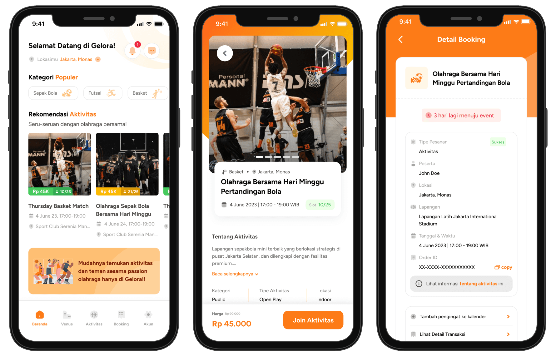
Homepage
Homepage

Click Image to Zoom
1
1
Easier Communication
Easier Communication
On the website, users can't directly communicate with admin and it is harder to be informed about the activity. On mobile, users can easily communicate both with admin and other participants. Users will also get inform conditions about activities that they follow with notifications.
On the website, users can't directly communicate with admin and it is harder to be informed about the activity. On mobile, users can easily communicate both with admin and other participants. Users will also get inform conditions about activities that they follow with notifications.
2
2
Personalized Information
Personalized Information
On the website, users need to scroll through all lists of activities one by one to find the activities they want to join. On mobile, users will be offered their interest activities as prioritized categories, this is intended to make it easier for user to find their desired activities.
On the website, users need to scroll through all lists of activities one by one to find the activities they want to join. On mobile, users will be offered their interest activities as prioritized categories, this is intended to make it easier for user to find their desired activities.
3
3
Convenient and Accessible Near Information Discovery
Convenient and Accessible Near Information Discovery
On the website, users are not able to find nearby activities. On mobile, users are able to find closest activities from their location to join with.
On the website, users are not able to find nearby activities. On mobile, users are able to find closest activities from their location to join with.
4
4
Easy Navigation for Frequent Used Task
Easy Navigation for Frequent Used Task
On the website, navigation isn't clear and centralized which gives users time and confusion to find their needed menu. On mobile, we crafted navigation based on frequent tasks that users might do.
On the website, navigation isn't clear and centralized which gives users time and confusion to find their needed menu. On mobile, we crafted navigation based on frequent tasks that users might do.
2
2
Activity Details
Activity Details
In the website version, users often experienced confusion because the information hierarchy was difficult to digest.
In the website version, users often experienced confusion because the information hierarchy was difficult to digest.
PROBLEM FROM PREVIOUS UI
PROBLEM FROM PREVIOUS UI
Uninformative: The UI did not provide enough information about the community or the type of activity being held.
Limited information: The UI did not provide enough information about the activity, such as what facilities they would have access to for the price they were paying.
Lack of detail: The UI did not provide enough detail about the place where the activity was being held, such as the address, facilities, or trustworthiness of the community.
These issues made it difficult for users to make informed decisions about whether or not to join an activity.
These issues made it difficult for users to make informed decisions about whether or not to join an activity.

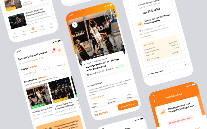
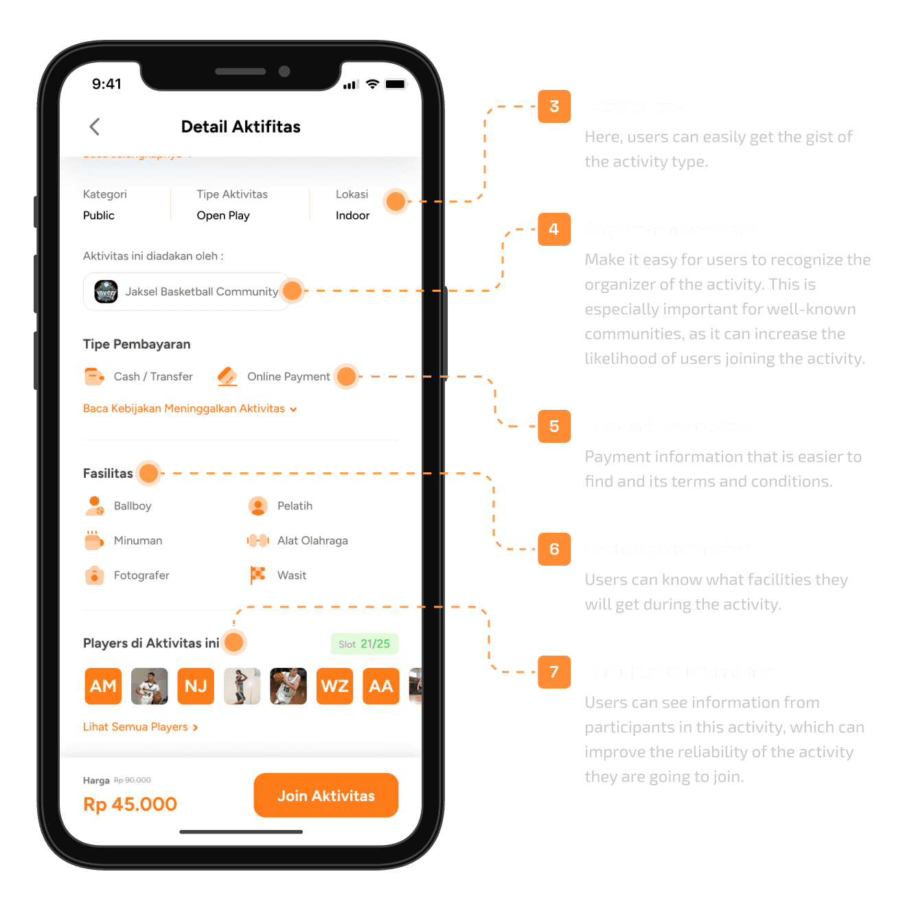
Activity Details Redesign for Mobile Version
Activity Details Redesign for Mobile Version
The new hierarchy is expected to help users make an informed decisions and find their needs easily.
The new hierarchy is expected to help users make an informed decisions and find their needs easily.

In addition to addressing the problems with the previous design, I also created a new look and feel that still aligns with the Gelora brand. This was done with the goal of increasing user engagement and enhanced brand image from user when they using the app.
In addition to addressing the problems with the previous design, I also created a new look and feel that still aligns with the Gelora brand. This was done with the goal of increasing user engagement and enhanced brand image from user when they using the app.
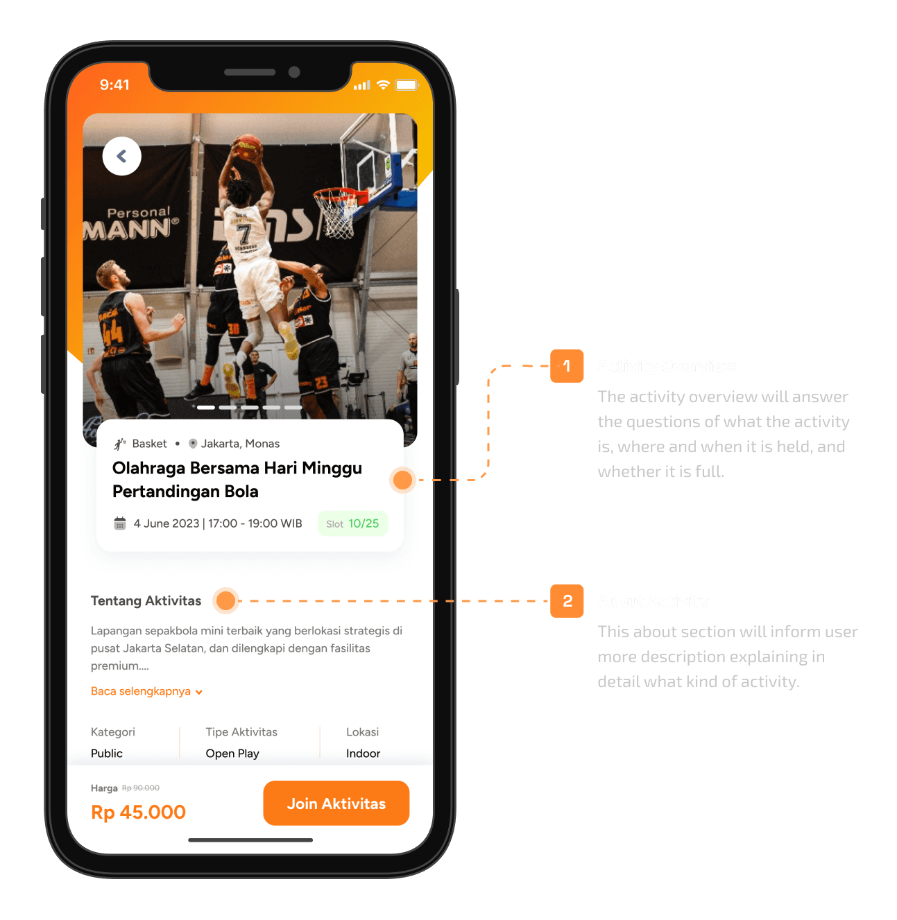
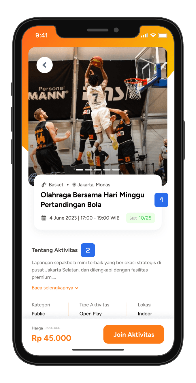
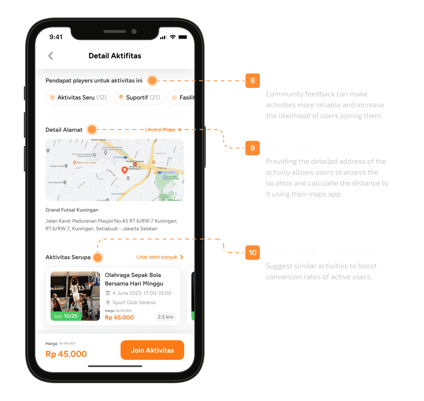
1
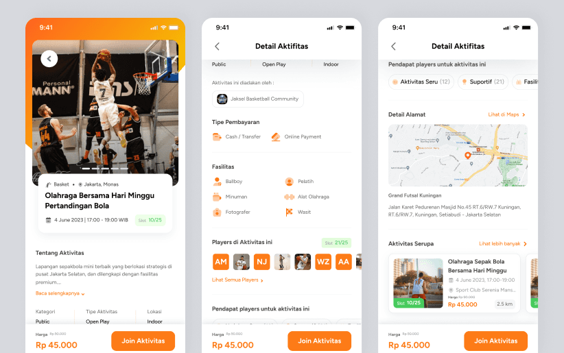
Activity Overview
The activity overview will answer the questions of what the activity is, where and when it is held, and whether it is full.
2
About Activity
This about section will inform user more description explaining in detail what kind of activity.
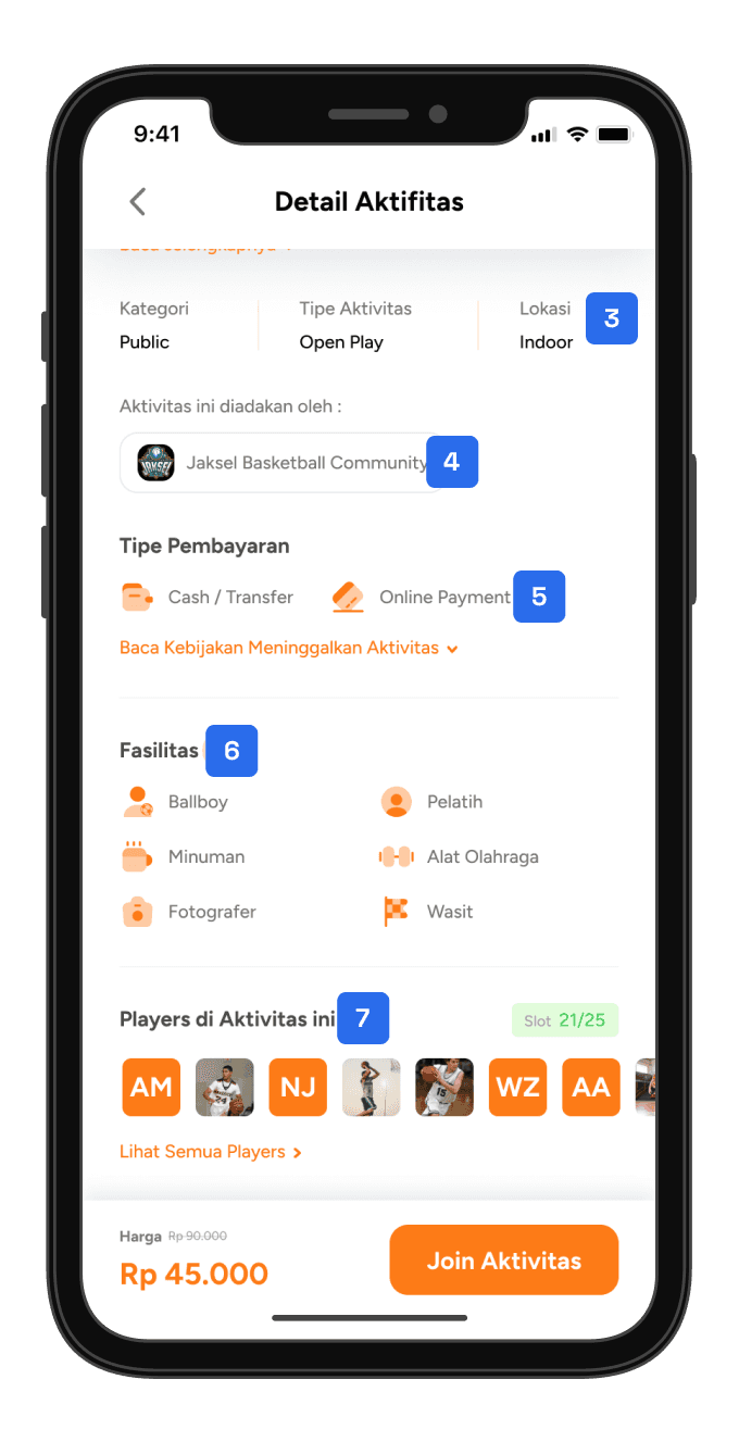
3
Activity Type
Here, users can easily get the gist of the activity type.
4
Organizer Information
Make it easy for users to recognize the organizer of the activity. This is especially important for well-known communities, as it can increase the likelihood of users joining the activity.
5
Payment Information
Users can know what facilities they will get during the activity.
6
Facilities Information
This about section will inform user more description explaining in detail what kind of activity.
7
Participants Information
Users can see information from participants in this activity, which can improve the reliability of the activity they are going to join.
8
Community Feedback
Community feedback can make activities more reliable and increase the likelihood of users joining them.
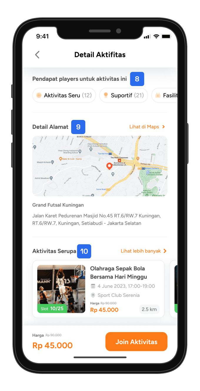
9
Detail Address
Providing the detailed address of the activity allows users to assess the location and calculate the distance to it using their maps app.
10
Similar Activity Recommendation
Suggest similar activities to boost conversion rates of active users.
3
3
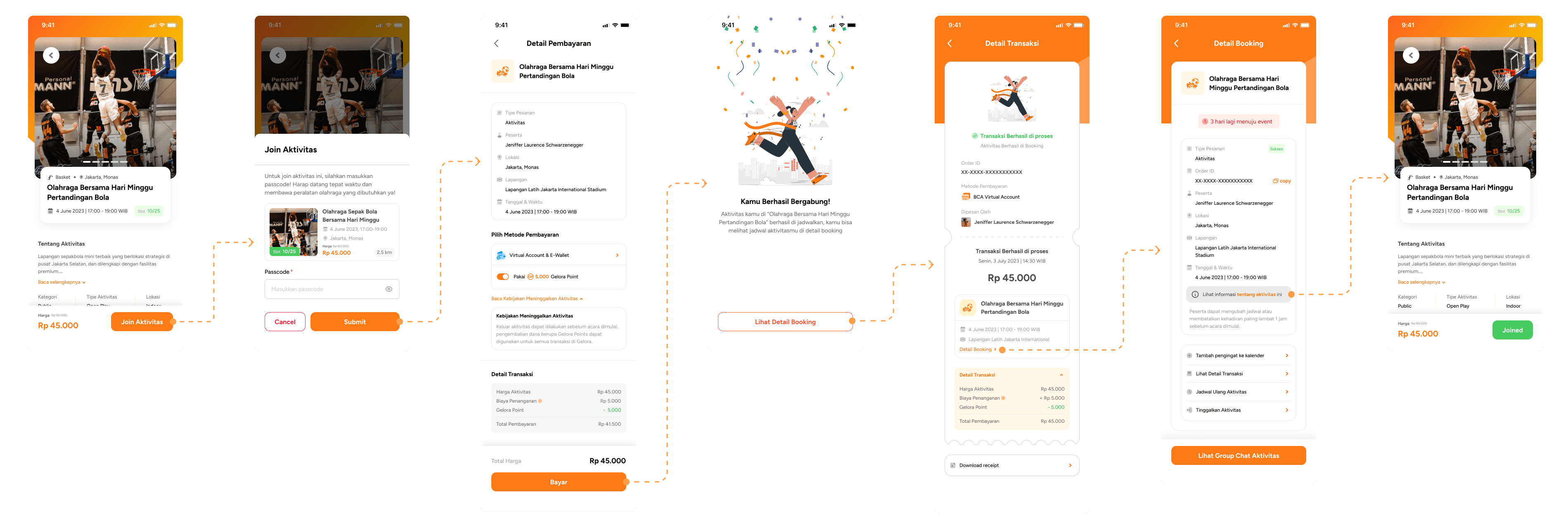
Join Activity
Join Activity
In the current flow, users who haven't made a payment are counted as occupying a slot, and they can either leave the activity or proceed with the payment as mention before this lead into slot-blocking domino effect.
To improve the flow, I removed the queue process because old data shows that the number of people who join activities is not high enough to cause server downtime. I also added a success screen after the user processes the payment to indicate whether the payment was successful, as processing payments involves loading and there is a possibility of failure.
Click Image to Zoom
Click Image to Zoom
PROBLEM FROM PREVIOUS FLOW
PROBLEM FROM PREVIOUS FLOW
Users who haven't made a payment are counted as occupying a slot, which can lead to a slot-blocking domino effect.
Users who haven't made a payment are counted as occupying a slot, which can lead to a slot-blocking domino effect.
IMPROVEMENTS
IMPROVEMENTS
Removed the queue process, as old data shows that the number of people who join activities is not high enough to cause server downtime.
Added a success screen after the user processes the payment to indicate whether the payment was successful.
Removed the queue process, as old data shows that the number of people who join activities is not high enough to cause server downtime.
Added a success screen after the user processes the payment to indicate whether the payment was successful.
4
4
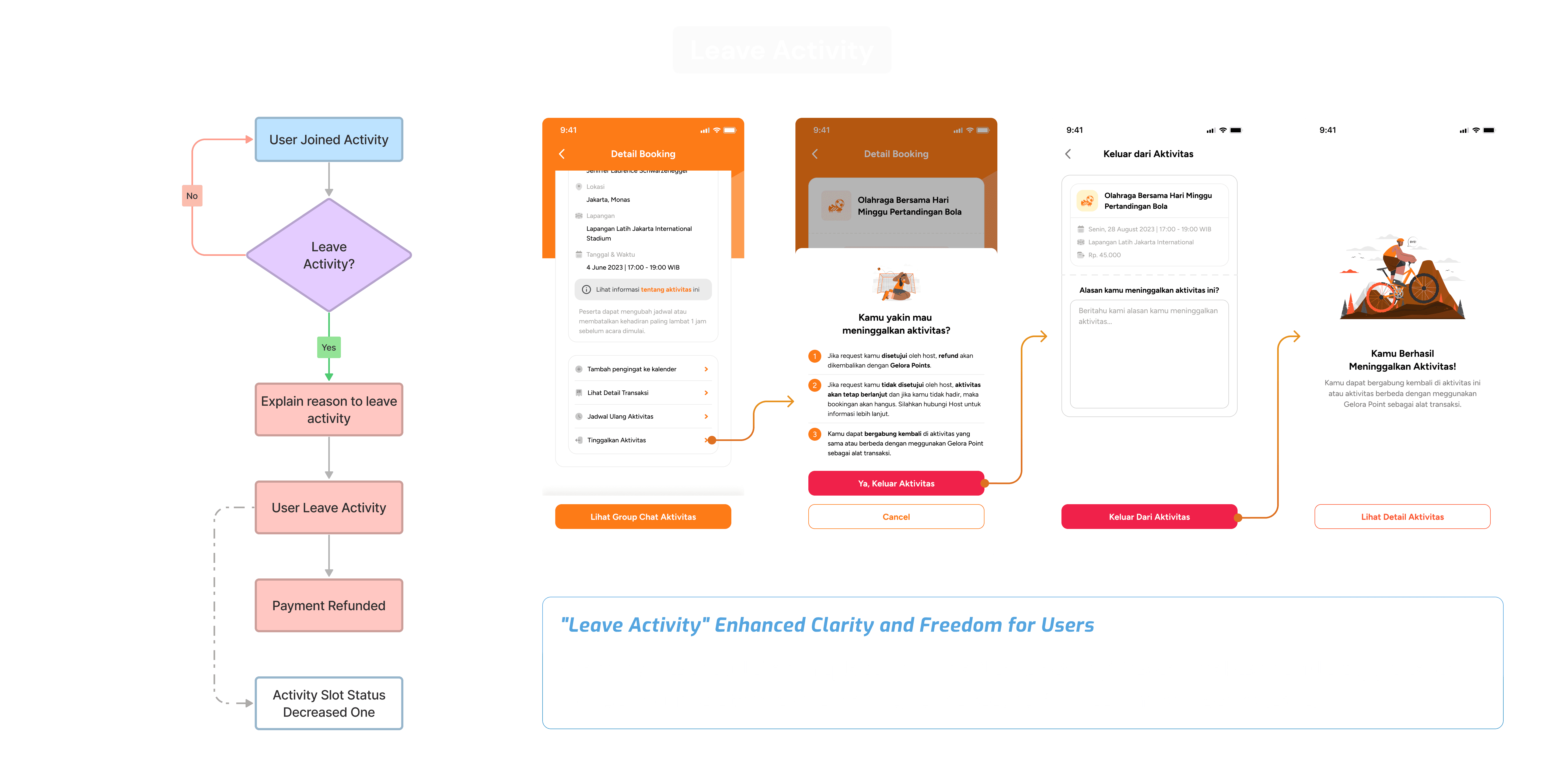
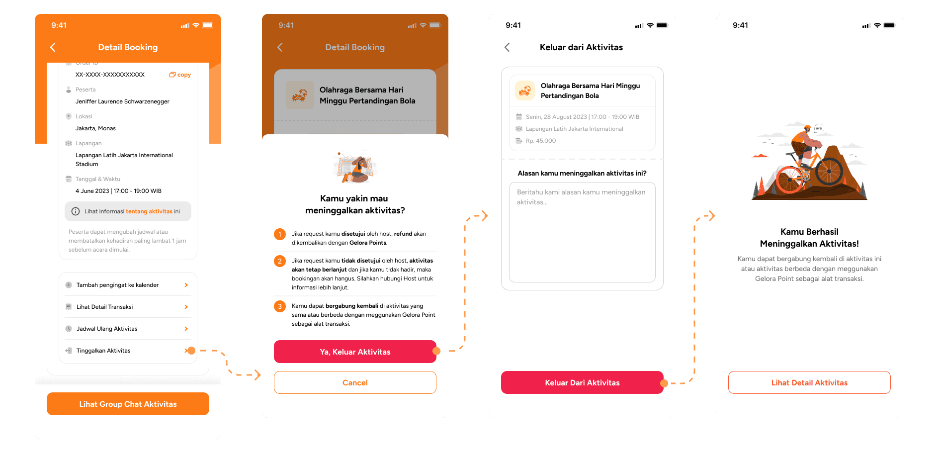
Leave Activity
Reschedule Activity
I have designed the leave activity flow to be the same as the rescheduled request flow in the current. The change on name is purposely to make user state clearer and user might still feel freedom since they can leave activity. I have added a form for the user to provide a reason for leaving the activity because this information will be used by the admin to assess why the user left. This will provide the admins with data on the reasons why participants leave activities.
I have designed the leave activity flow to be the same as the rescheduled request flow in the current. The change on name is purposely to make user state clearer and user might still feel freedom since they can leave activity. I have added a form for the user to provide a reason for leaving the activity because this information will be used by the admin to assess why the user left. This will provide the admins with data on the reasons why participants leave activities.
IMPROVEMENTS
IMPROVEMENTS
Name changed to "leave activity" to make user state clearer and give users a sense of freedom.
Added a form for users to provide a reason for leaving the activity.
Name changed to "leave activity" to make user state clearer and give users a sense of freedom.
Added a form for users to provide a reason for leaving the activity.
Click Image to Zoom
Click Image to Zoom
5
5
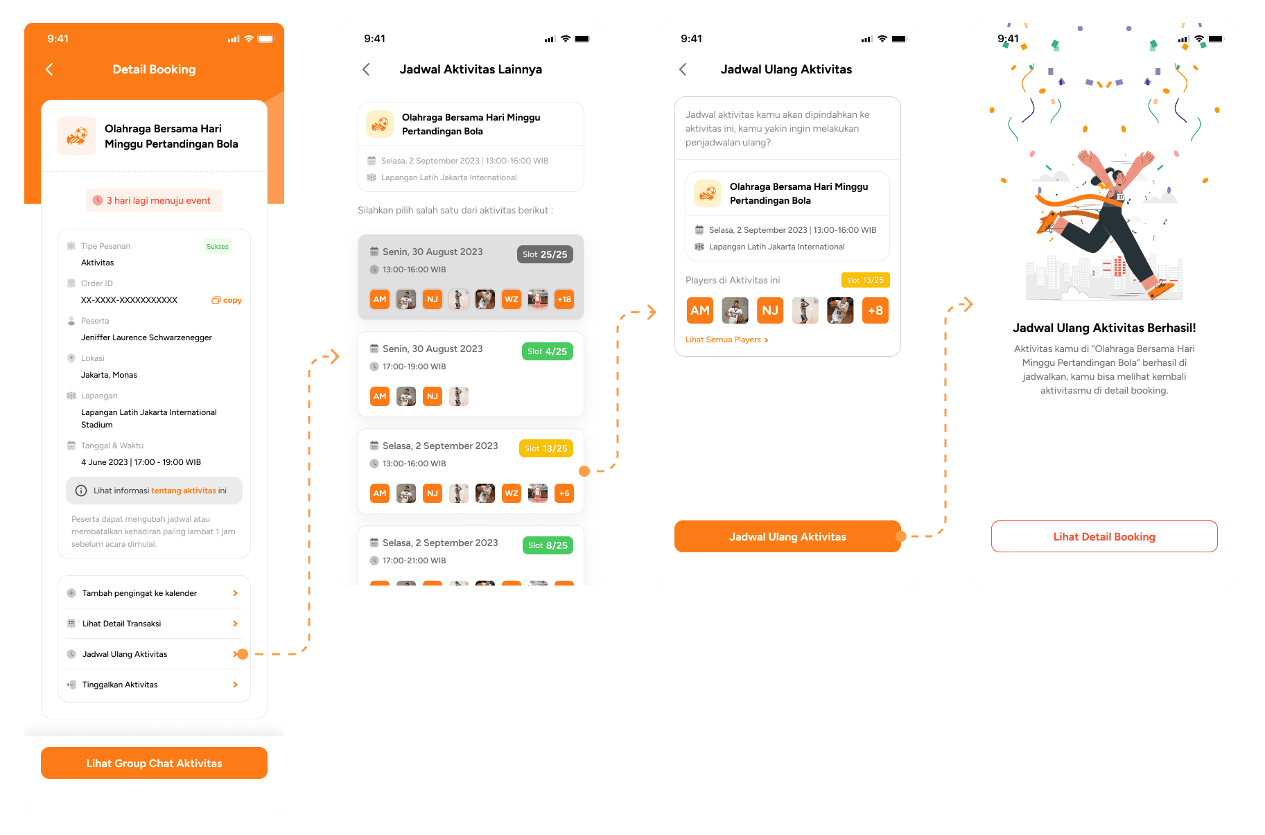
Reschedule Activity
Reschedule Activity
In the reschedule activity, users can select a replacement schedule and see a list of the players in the activity. Activity details are not added because this is still the same activity with the same details and only has a different schedule.
In the reschedule activity, users can select a replacement schedule and see a list of the players in the activity. Activity details are not added because this is still the same activity with the same details and only has a different schedule.
IMPROVEMENTS
IMPROVEMENTS
Users can select a replacement schedule.
Users can see a list of the players in the activity.
Users can select a replacement schedule.
Users can see a list of the players in the activity.
Click Image to Zoom
Click Image to Zoom
Design System
Design System
As an initial launch we have also implemented a design system for this project, making it easier to maintain and iterate on the design in the future. Here is a sneak peek at how we organize the design system for this project that might become a longterm product.
As an initial launch we have also implemented a design system for this project, making it easier to maintain and iterate on the design in the future. Here is a sneak peek at how we organize the design system for this project that might become a longterm product.

Click Image to Zoom
Design Validation
Design Validation
Design is about planning, but to measure the success of our plan, we need to test it. I have developed 4 scenarios and 4 hypotheses to validate:
Design is about planning, but to measure the success of our plan, we need to test it. I have developed 4 scenarios and 4 hypotheses to validate:
1
1
Which design do users find more engaging and informative?
Which design do users find more engaging and informative?
This scenario will test users' preferences for the old and new designs of the app. The goal is to understand which design users find more engaging and informative, and why they chose one of the design.
This scenario will test users' preferences for the old and new designs of the app. The goal is to understand which design users find more engaging and informative, and why they chose one of the design.
2
2
Does new activity detail page clear enough to make an inform decision for user?
Does new activity detail page clear enough to make an inform decision for user?
This scenario will test the clarity and usability of the new activity detail page. By ensuring that users can easily understand the information on the page, we can help them to make more informed decisions about whether or not to join an activity.
This scenario will test the clarity and usability of the new activity detail page. By ensuring that users can easily understand the information on the page, we can help them to make more informed decisions about whether or not to join an activity.
3
3
Does new join flow give correct expectation to our user?
Does new join flow give correct expectation to our user?
This scenario will test the accuracy of the new join flow. By ensuring that users understand the steps involved in joining an activity, are the design able to reduce the risk of frustration and confusion.
This scenario will test the accuracy of the new join flow. By ensuring that users understand the steps involved in joining an activity, are the design able to reduce the risk of frustration and confusion.
4
4
Does new leave and reschedule flow are clear enough for user to understand?
Does new leave and reschedule flow are clear enough for user to understand?
This scenario will test the clarity and usability of the new leave and reschedule flow. By ensuring that users can easily leave or reschedule an activity.
This scenario will test the clarity and usability of the new leave and reschedule flow. By ensuring that users can easily leave or reschedule an activity.
Testing Insight, From Data to Discovery
Testing Insight, From Data to Discovery
Here are several insight that we get based on survey and interview for testing our new design compare to the last one on website version :
Here are several insight that we get based on survey and interview for testing our new design compare to the last one on website version :
1
1
New Design is Preferable
New Design is Preferable
Most participants expressed a preference for the new mobile design, finding it visually appealing and engaging, thereby enhancing their motivation to explore.
Most participants expressed a preference for the new mobile design, finding it visually appealing and engaging, thereby enhancing their motivation to explore.
2
2
Clear Intention, Expected Output
Clear Intention, Expected Output
The leave and reschedule activities are sufficiently clear, enabling users to comprehend the expected outcomes for each workflow.
The leave and reschedule activities are sufficiently clear, enabling users to comprehend the expected outcomes for each workflow.
3
3
Informative Detail Activity
Informative Detail Activity
The majority of participants concur that the new design for detailed activities provides them with more valuable information compared to the website version, potentially aiding them in making well-informed decisions.
The majority of participants concur that the new design for detailed activities provides them with more valuable information compared to the website version, potentially aiding them in making well-informed decisions.
4
4
Activity Schedule, Where the Other?
Activity Schedule, Where the Other?
Some users have noticed that, when performing tasks related to rescheduling activities, the activity details do not contain a list of schedules; rather, each schedule has its own dedicated detail page.
This design choice is a result of the app's new entry into the market, with limited partners. The intention is to prevent the app from appearing deserted. However, we plan to enhance this feature in the future as our partner and community base grows.
Whats Next? Evaluate UX Factors and Future Possibilites
Whats Next? Evaluate UX Factors and Future Possibilites
My favorite part of this process is identifying user behavior through analytics and gaining a deeper understanding of how they interact with our product. Due to an NDA, I can't share too many specifics, but during this phase, the design team evaluates a matrix of activity conversion and churn rates for the activity journey. We also create funnels to identify areas where users are dropping off.
My favorite part of this process is identifying user behavior through analytics and gaining a deeper understanding of how they interact with our product. Due to an NDA, I can't share too many specifics, but during this phase, the design team evaluates a matrix of activity conversion and churn rates for the activity journey. We also create funnels to identify areas where users are dropping off.
retrospective
Reflecting on the Path from Vision to Vignettes
Reflecting on the Path from Vision to Vignettes
The design seems to be well-done, which has led to another buy-in with our client for another new phase together. However, since this is an initial phase, the first step for the product to get into the market, there is still much to improve on the journey to achieve ever-evolving goals that I wish in the future there will be a dedicated timeline for the team to do in depth research and testing. I am very grateful to have been able to in charge for this project, and even though it is not perfect, I have done my very best and am satisfied with my work.
The design seems to be well-done, which has led to another buy-in with our client for another new phase together. However, since this is an initial phase, the first step for the product to get into the market, there is still much to improve on the journey to achieve ever-evolving goals that I wish in the future there will be a dedicated timeline for the team to do in depth research and testing. I am very grateful to have been able to in charge for this project, and even though it is not perfect, I have done my very best and am satisfied with my work.
Snowflake-Proofing
Snowflake-Proofing
It is important to have a well-thought-out plan from the start, starting from the architecture and app flow, as well as every edge case, so that it does not become a compounding snowball in the future.
It is important to have a well-thought-out plan from the start, starting from the architecture and app flow, as well as every edge case, so that it does not become a compounding snowball in the future.
Flexibility, Middle Ground Solution
Flexibility, Middle Ground Solution
There is no perfect solution, because there will always be limitations such as timeline and also some decisions and desires of each stakeholder. What can be done is to find a middle ground where at least can reduce risk of experience on the product.
There is no perfect solution, because there will always be limitations such as timeline and also some decisions and desires of each stakeholder. What can be done is to find a middle ground where at least can reduce risk of experience on the product.
Perfect Design Doesn't Exist
Perfect Design Doesn't Exist
There will always be improvements from every design that is made. Maybe now I think this is the best solution, but the shortcomings will certainly always appear following the development of time and the digital behavior patterns of humans.
There will always be improvements from every design that is made. Maybe now I think this is the best solution, but the shortcomings will certainly always appear following the development of time and the digital behavior patterns of humans.
40% Designing 60% Communication
As a designer, designing and crafting is an essential skill, but there is still a more important skill, communication and negotiation. Where 60% of the process is discussion and communicate with each stakeholders.
As a designer, designing and crafting is an essential skill, but there is still a more important skill, communication and negotiation. Where 60% of the process is discussion and communicate with each stakeholders.
Whats Next?
Whats Next?
Since we are going to run on new phase, new extension and new feature will be release. I think better to have well thought goals and metrics before calculating on timeline and other scope of works. Like, what we want to achieve in new phase and what we want to improve from data based on current design. When the destination is clear, execution is only a matter of time.
Since we are going to run on new phase, new extension and new feature will be release. I think better to have well thought goals and metrics before calculating on timeline and other scope of works. Like, what we want to achieve in new phase and what we want to improve from data based on current design. When the destination is clear, execution is only a matter of time.
NEXT PROJECT
NEXT PROJECT